·Ensure coach is from a reputable, recommended coach service.
·Ensure no parties take place
·Health and safety talk
3
ü
Going to a forest someone could slip on the mud.
Injured
Teacher
Students
·No running
·Watch where your walking
·Stay with someone at all times
2
ü
Driving to location ourselves.
Car accident
Injured
Death
Students
·Careful driving
·Sensible driving
2
ü
Old building.
Falling bricks
Sharp stuff on the floor
Students
·Be aware of your surrounding
3
ü
Stinging nettles.
Being stung
Allergic reaction
Students
Teacher
·Be careful where you walk
·Always be with someone
·Use a doc leaf to help irritation
2
ü
Personal illnesses
Asthama attack
Anathalatic shock
Student
Teacher
Driver
·Have appropriate medication on you
·Make sure who you are with is aware
2
ü
We created this health and safety form to make sure as a group we were aware of the dangers that we may encounter while filming.
By doing this , this enables us to be prepared for any accidents that may arise and deal with the accordingly. This health and safety form
was written by my team member Kala Hill.
Embedded above is the costumes we used in our horror sequence. Starting with Kayleigh (on the left) we chose for her to have typical everyday clothing on and keep them quite light. These colours connote innocence and just an everyday , typical teen age girl. However we felt to contrast this with the black coat , this has an effect of a shadow which follows Kayleigh around , it shows she has a darker past than first thought. Then with Clara (on the right) we decided to keep with the theme of 'their darker past' , this is what follows Kayleigh around on a daily basis and makes it apparent that Clara is the secret Kayleigh is trying to keep. Therefore Clara is in all black as she is the 'shadow' Kayleighs darker past.
While out for filming we took pictures of the location we used. Embedded below are pictures from Bentley priory in a slideshow which I made using Animoto , which is one of two locations we used for our horror movie opening sequence. We felt this was a good location to use for our horror movie as it follows may typical conventions found within horror movies.
One of the first images show that Bentley priory is typical forest , this is a convention found in horror movies as the location denotes isolation and vulnerability. The character is normally shown running from the antagonist through the woods and often gets trapped. We slightly followed this as Kayleigh our main character is being followed by her past through the woods. Additionally we thought the use of the brick hut was very affective , as it was abandoned and ruined. We felt this helped with the idea that some sort of history is hidden within this place.
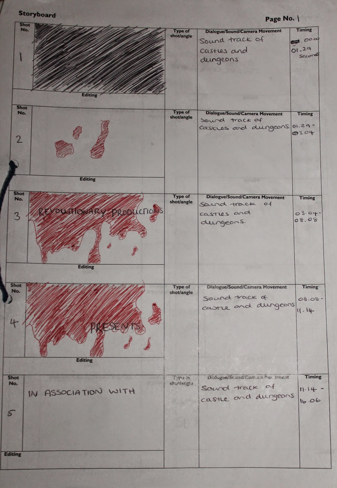
Embedded below is the storyboard Kala Hill drew in preparation for creating our group ident for our horror movie opening sequence.
Georgia was in charge of creating the ident, written below is the process she went through in creating this:
The ident was then created by myself using Final Cut Pro. The ident has a blood design, seeping in on screen as the company name is introduced, a conventional aspect of the horror genre and as a group we felt that this was an effecftive way of creating our ident. The blood has clear connotations of danger and fear, the red colour dominant over the black background the ident first displays, the seeping blood provoking a tension build from the viewers. The slow, sweeping movements of the titles connotes ghost like actions, another convention addressed in our horror movie sequence, also foreshadowing the potential character of a ghost in the film. The simplicity of the sweeping titles, and the colour of them being black and white adds to the tension build intended and also adheres to the many credits of horror movies we have previously researched, of which they keep the fonts and colouring of text very simple, to emphasise the effect of the ident and beginning of the movie that follows.
Before creating our own ident for our horror movie , individually we are researching into idents. By definition an ident is : 'Short for identification , especially in informal or technical use, this is usually a short sequence shown at the start of films to identify the company' -http://www.oxforddictionaries.com/definition/english/ident
I will be looking at the design of the ident and explaining what the audience can see. Then I will explain why I believe they did that and what effect this has.
Design: This is on of two dominant 'Dreamworks' animation idents and it has duration of 23 seconds. The animation begins with the camera travelling upwards through the clouds , then as is progresses the sight of a crescent moon comes into view.Then travelling upwards is a cluster of clear balloon with what appears to be an adolescent boy attached to them. Once at the high of the moon , the boy sits down on it and lets go of the balloons. The camera then follows the balloons as they travel further up into the sky and then the balloon explode to form the word 'Dreamworks' in the sky.
Intention: The connotations of the sky and the moon could be a way of showing how big and powerful the company is. Additionally connotations of the moon is serenity and calmness this could be a representation of the films they produce , as most films made by Dreamworks are happy family films. This can also be shown through the use of colour when 'Dreamworks' appears on the screen and the use of an adolescent boy in the sequence. Finally clouds usually symbolise dreams , it appears the 'Dreamworks' have played on this due to the name of their company and therefore throughout the sequence clouds are a dominant feature.
Secondly I looked at an ident which is more common of the horror movie theme. I choose to look at how dreamworks altered their child friendly ident to fit a horror movie. http://www.youtube.com/watch?v=AzSuDbibt9Y
Design: The ident begins with the camera tracking along a reflection of cloud and the moon in the water. The a fishing rod appears in the water, the camera then pans up to show the adolescent boy sitting on the crescent moon with a fishing rod in his hand. The moon the forms into the shape of a 'D' , the camera then tracks along showing the word 'Dreamworks' forming in the sky. The sequence is significantly darker than the previous ident and throughout the image becomes distorted.
Intention: As this ident is trying to represent a horror movie , they have intentionally edited their ident to fit the genre. As in their previous ident there is the use of bright colours to represent their family friendly films , now the ident is quite dark and dim to portray that the movie is of a darker form. Additionally the distortions used throughout portray that this is a different form of movie and something you wouldn't expect from dreamworks , it shows their typical genre has been distorted.
Then one of my team members Georgia Pearce went on to research into disney idents and this information is shown below.
In the development of making our beginning scenes of a Horror movie, we researched into the importance and varied range of different idents. Below I have embedded a definition of what an ident is from http://www.oxforddictionaries.com/definition/english/ident .
An ident is what identifies the company that produces the film playing. Some big companies include Lionsgate, Warner Bros., 20th Century Fox and Disney.
The first ident I analysed was the ident used by Disney, embedded from The Ident Gallery.
This ident denotes a blue sky, panning across a river and city to reveal the Disney castle, a firework show in the background. The words 'Walt Disney pictures' are revealed, and a streak of light appears around the castle. Although this is a lot more animated and complex than the original company ident (embedded below), it is still very iconic. This ident is now used on most Disney films from 2006 onwards. The intention of this ident connotes a theme of magic, which appeals to the target audience of children and families. Furthermore, the castle is an iconic element that is present in the Disney amusement parks, such as Disney World Florida. The castle is evidently a part of Disney and their logo, as well as their history of the company.
Companies such as Disney occasionally use alternative idents to appeal to appropriate films, or for anniversay editions, genre of film, modernising, to mimic or give a nod to a film for example live action films such as Tron.
Disney have continued to change and modernise their ident for many different films, suggesting to the audience that after the so many years off being a prestige company, they still want to be contemporary and just as relevant as any other production company in the contemporary era of the film industry. The ident for Tron, embedded above, displays Disney as a company evolving into more graphic live action movies, using technologically advanced cgi and special effects, as foreshadowed in their ident for the film. The ident also reflects the theme of the movie, incorporating the use of lights and sci-fi genre and the iconic Disney castle. Another sci-fi genre ident is from the film Lilo And Stitch (2002), embedded below, in which the logo itself gets abducted by aliens, connoting the film plot line involving aliens and reinforcing the genre of sci-fi and action. The castle is displayed on an alternative black background. A green laser appears around the castle instead of the usual magic dust. A beam of green light then appears over the logo, and it shakes and elevates upwards. This is to connote UFOs and alien life, which relates to the storyline as the lead character Stitch is an alien.
Below I have created a step outline while watching 'The ring' as part of our research into the horror movie genre. Within this I have looked at the types of cuts used , the duration, the miss-en-scene and the editing used.
Below my team member Georgia Pearce completed the same activity and watched 'The Purge'.
‘The Haunting’ follows a teenage girls’ traumatic walk through the forest as she sees distorted hallucinations that increasingly play with her mind, reminding her of the day her best friend tragically died.
Synopsis
·Kayleigh wakes up and starts to get ready to take her dog on a walk. She appears to be disturbed by a traumatic event yet to be discovered.
·As she takes a walk through the woods, her past begins to be revealed, the truth of her friends death Clara becomes clear.
·Shots of Kayleigh hallucinating Clara walking next to her and running through the woods
·Hallucination of Clara screaming, Kayleigh increasingly becoming worried
·Runs towards the hut where Clara was killed, still hallucinating
·Stands in the hut to see nothing there, looking panicked
·Clara appears behind her, looking sinisterly towards Kayleigh.
Resources Needed
·Camera
·Tripod
·Dog
Locations · House · Forest · Hut
Characters
·Kayleigh
·Clara
Justification For Your Ideas
Our ideas follow the conventions of a horror narrative. Psychological elements are conveyed through hallucinations and Paranormal elements are conveyed through the haunting from Clara, Kayleigh’s dead friend. Many people said I our survey they wanted quick cuts, and so we will include this to appeal to our target audience. There is the idea of a ghost/spirit haunting someone and a location of a forest is also very stereotypical of horror.
Embedded below is the link to our Padlet, we have used this to gain feedback about our ideas for the horror movie opening.From these suggestions we will amend and change any problems that arise.
While editing our horror movie we had to ensure that our editing was realistic, things like continuity we ensured that was precise and matched up so that our final outcome didn't appear to be overly artificial, this helped with making the horror movie a real life situation. Any transitions that we used during editing our clip we made sure that they were not to obvious to the eye by using straight quick cuts that matched up perfectly to disguise them or if they were obvious it was because a complete change in the scene was taking place.